Assignments > Intro to Tableau Public
Due Tue, 09/30 at 11:59pm
Reference Materials for Today's Lab
- Today's tutorial is based on this video: Tutorial: Tableau Public for ULTRA Beginners. If you get stuck on anything, feel free to go back and watch the video.
- Sample Datasets (we will be working with the "Superstore" dataset)
- Tableau Public Cheat Sheet (Course Website)
Your Tasks for Lab 2
For Lab 2, you are going to make a "Superstore Sales" dashboard as a means to explore the various features of Tableau Public.
Before you begin, register for a Tableau Public account and download and install the Desktop software (see the Tableau Public Cheat Sheet). Then, complete the following 7 tasks:
- Load your data
- Make a bar chart (for practice)
- Make a line chart grouped by region
- Make a map of total profits
- Make a tree map
- Make a dual axis chart
- Make & publish a dashboard
1. Load Your Data
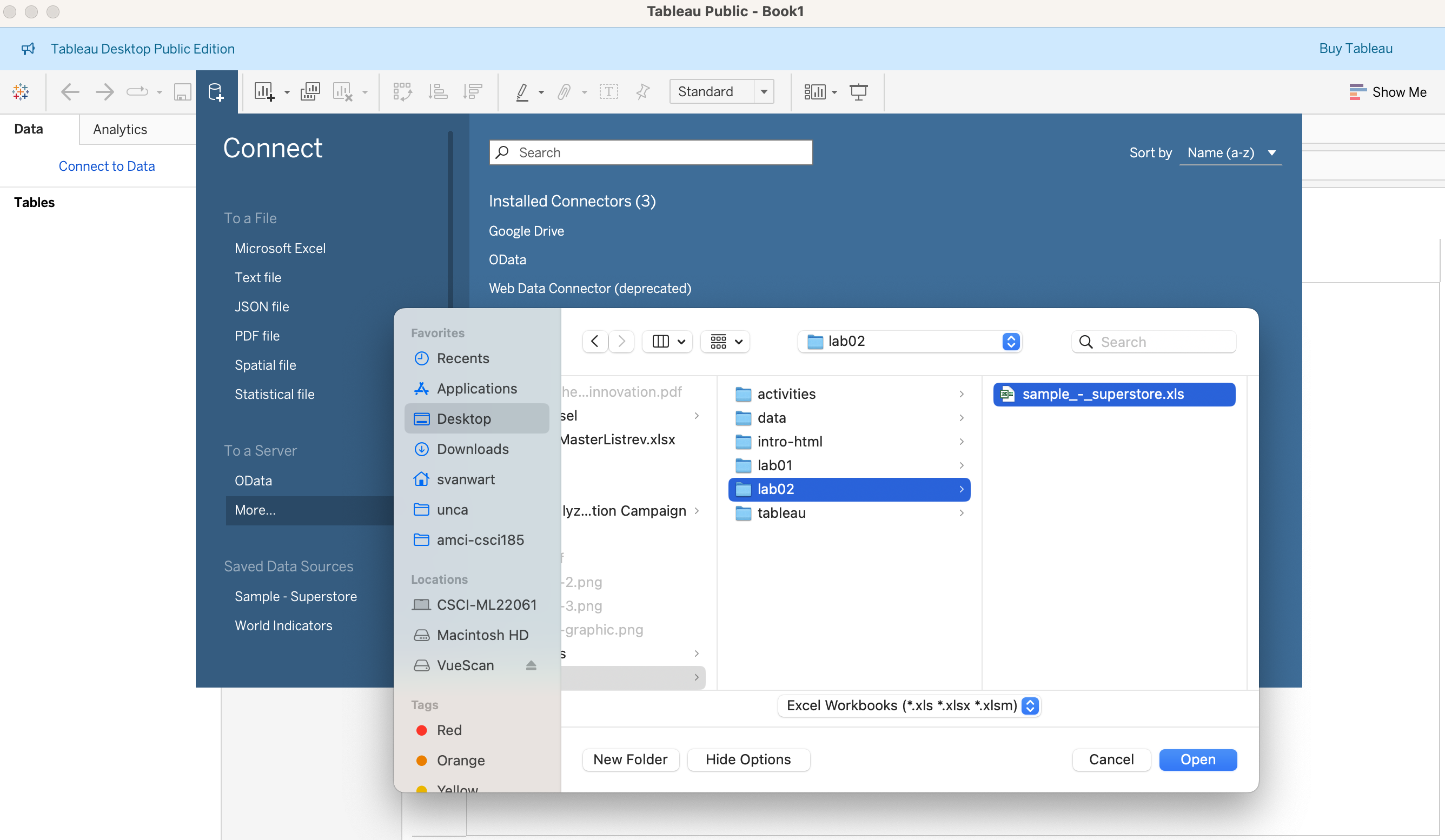
Let's download the "Superstore Sales" dataset here. Once downloaded, save the sample_-_superstore.xls file within your mser521 folder in a folder called lab02. Your directory structure should look something like this:
mser521
├── intro-html
├── lab01
└── lab02
    └── sample_-_superstore.xls
Then, load this dataset into Tableau:
Once loaded, drag the "orders" sheet into the main panel to display the data:
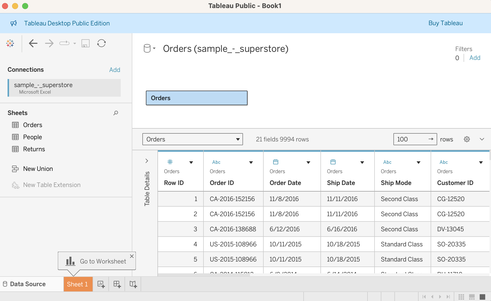
Once the data has been loaded, click on the "Sheet 1" tab at the bottom (highlighted in orange in the screenshot above).
2. Make a Bar Chart: Sales by Region
In sheet one, there should be a list of variables that you can use to create your charts. These variables are divided into dimensions and measures. Tableau automatically positions dimensions on the top and measures on the bottom.
Dimensions = categories, qualitative fields (e.g., Country, Product, Year).
- Typically discrete values.
- Used to group the data into categories.
Measures = numeric fields (e.g., Sales, Profit, Temperature).
- Typically continuous values.
- Used for calculations, aggregations (SUM, AVG).
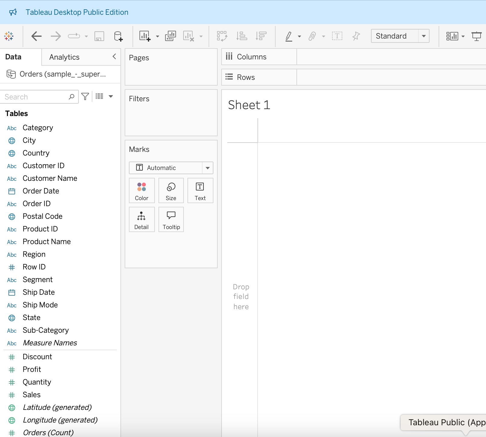
Double-click on the Sales measure and Region dimension. It should automatically create a bar chart for you:
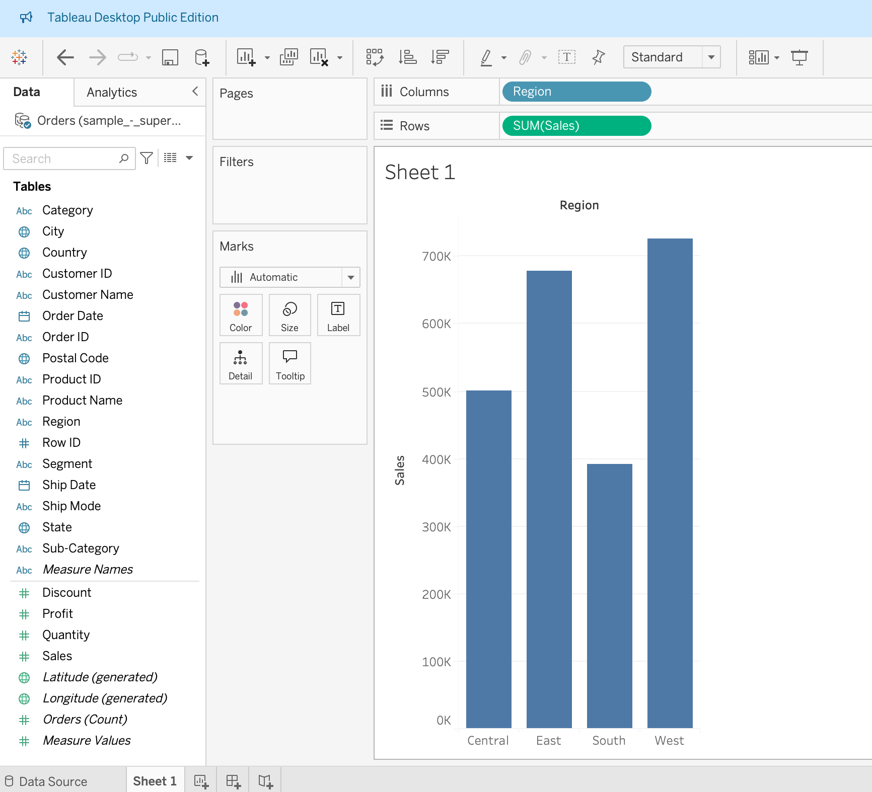
Tableau has a set of "smart defaults" for displaying various measure / dimension combinations. That said, you can click on the "Show Me" button on the upper right-hand corner of your screen and try out some of the other charts (pie chart, stacked bar chart, treemap, etc.)
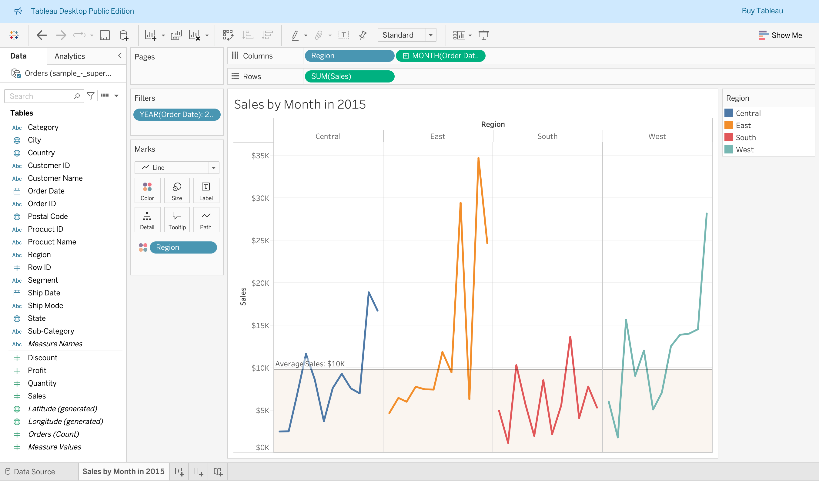
3. Make a Line Chart of Total Monthly Sales by Region in 2015
In a new sheet, see if you can make the following line chart, showing monthly sales grouped by region (small multiples). Filter the data so that it is only showing sales data for 2015.
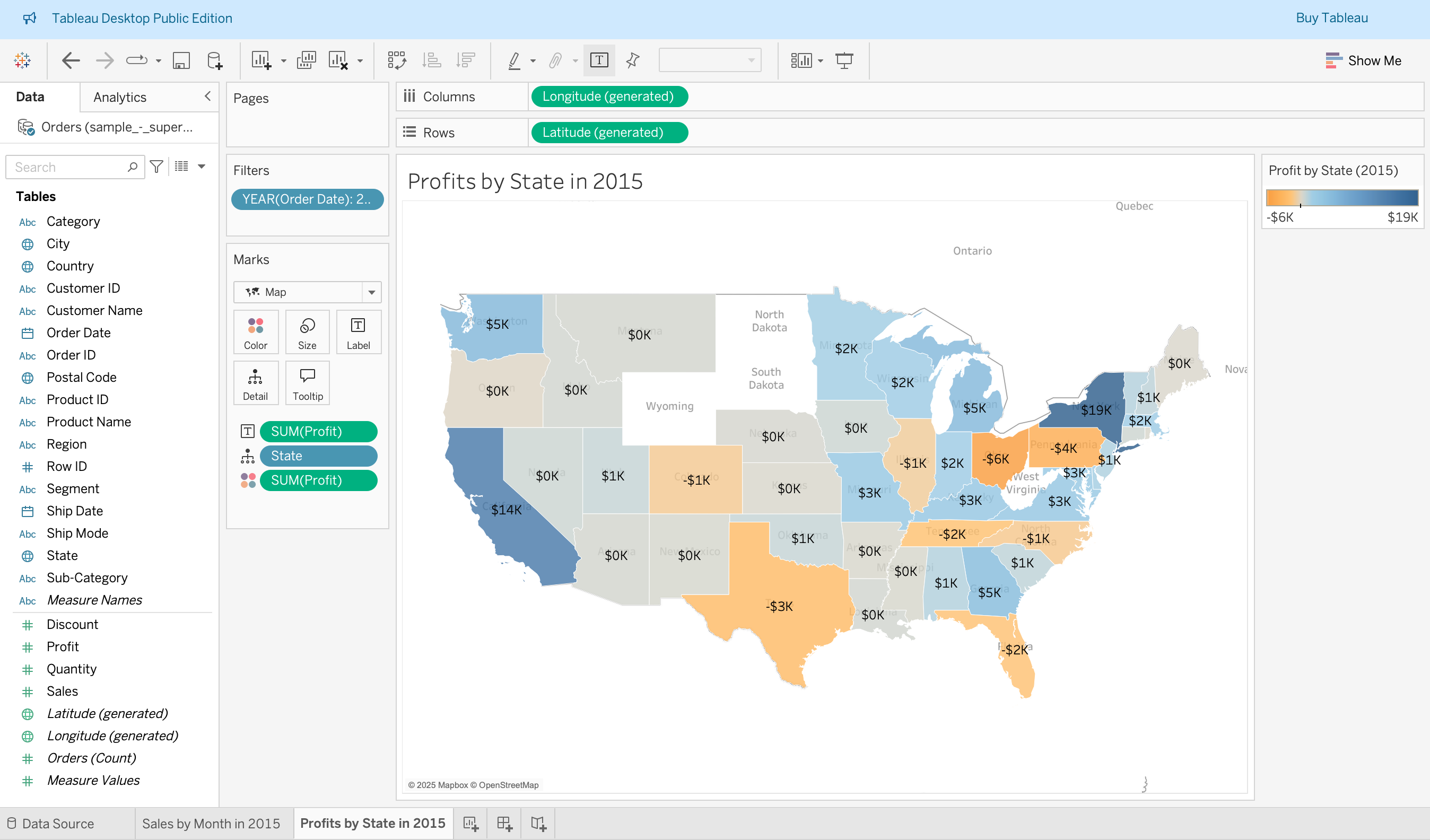
4. Make a Map of Total Profits by State in 2015
In a new sheet, see if you can make the following map, showing profit by state for the year 2015:
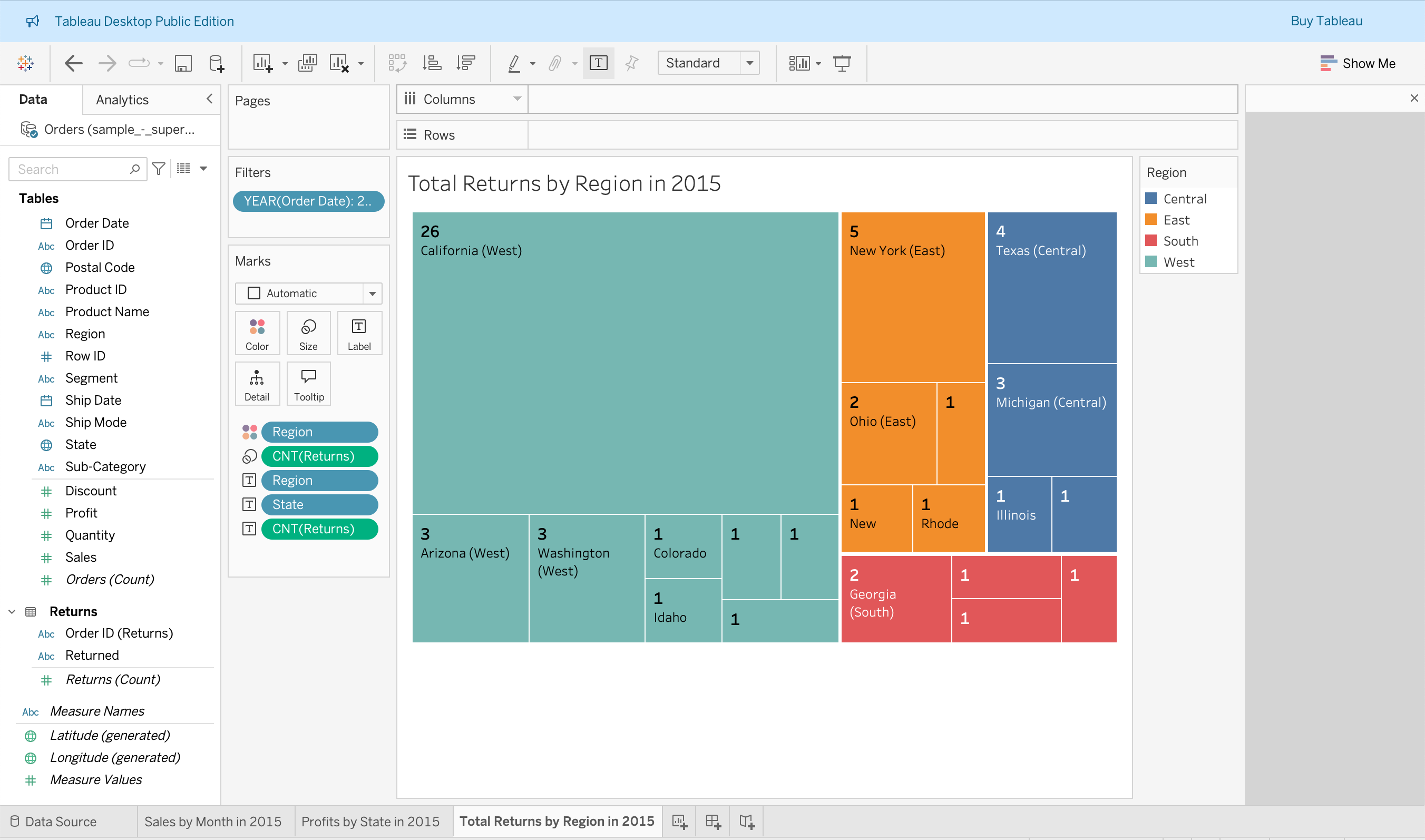
5. Make a Tree Map of Total Returns by Region by State in 2015
In a new sheet, see if you can make the following visualization, showing returns by region and by state for the year 2015:
6. Make a "Dual Axis" Chart Showing Profit and Sales in 2015
You may want to watch the tutorial video for this one. It's from timestamp 10:40-12:33:
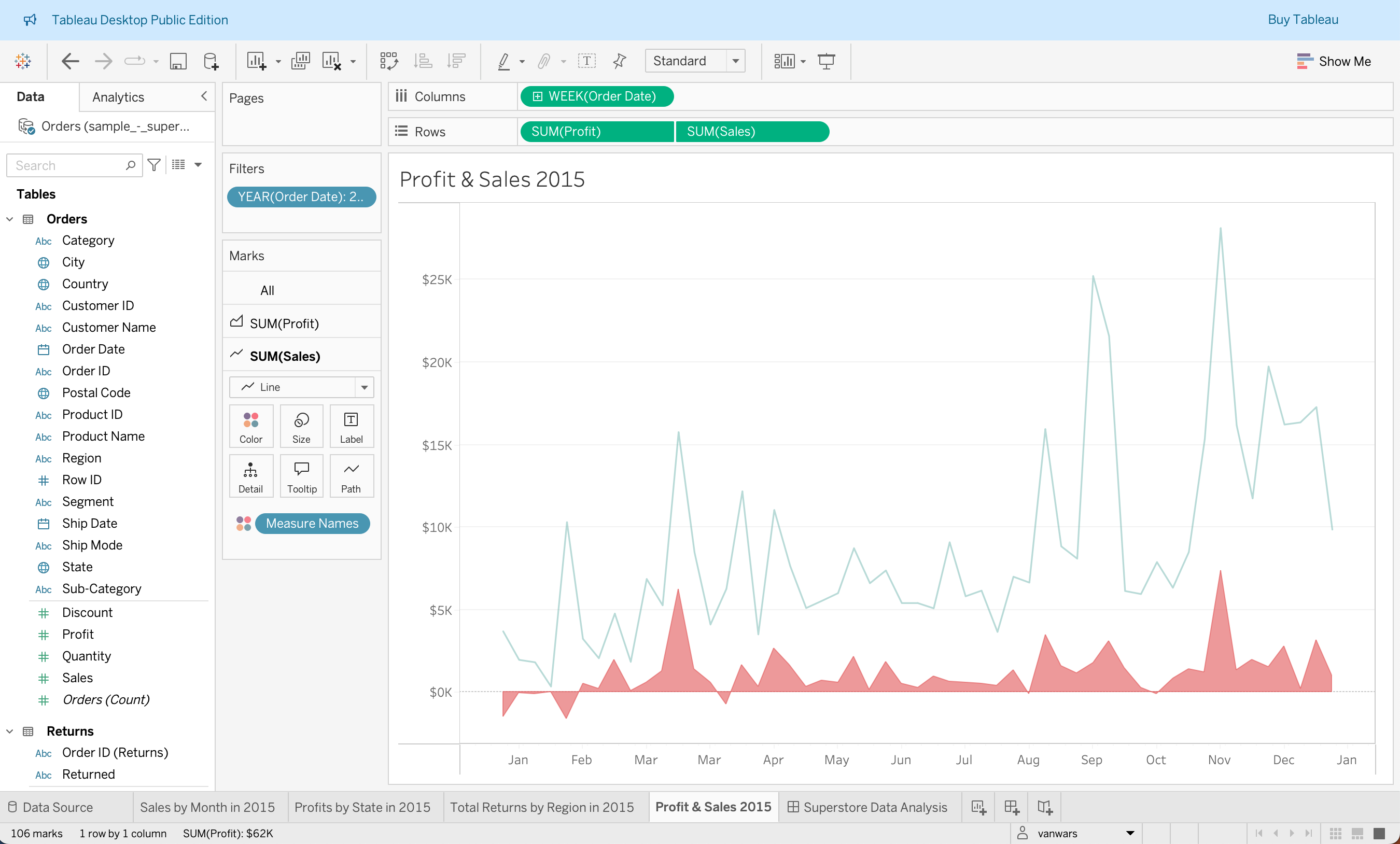
Hint: Visualize the timeseries data by week (continuous) rather than by day.
7. Make a Dashboard
Try making a dashboard that looks something like this (and see if you can get the filter to work):
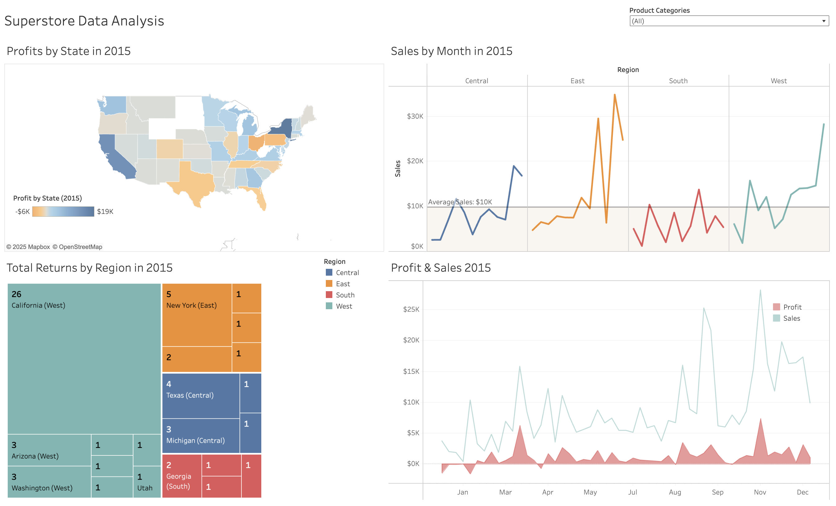
Here's a link to the Dashboard that I made.
It doesn't have to look exactly like the one pictured in the screenshot. Just do your best! When you're done, make sure you publish it to Tableau Public. The video tutorial goes over how to do this.
What to Turn In
When you're done, please turn in a link to your Tableau Public Dashboard on the Moodle.