7. Forests in Cities Network
Folder: 07_forests_in_cities/
Files: index.html, section5.css
Overview
The text-only card HTML structure is already provided in the style guide. Your job is to:
- Reference the style guide for the text-only card HTML structure
- Create 2 text-only cards using that pattern
- Add CSS for the section layout, background image, and responsive design
HTML (index.html)
Start with this HTML structure, which you will paste inside the <main></main> tag:
<!-- Section 5 (Forests in Cities Network) -->
<section id="section-5">
<div class="container">
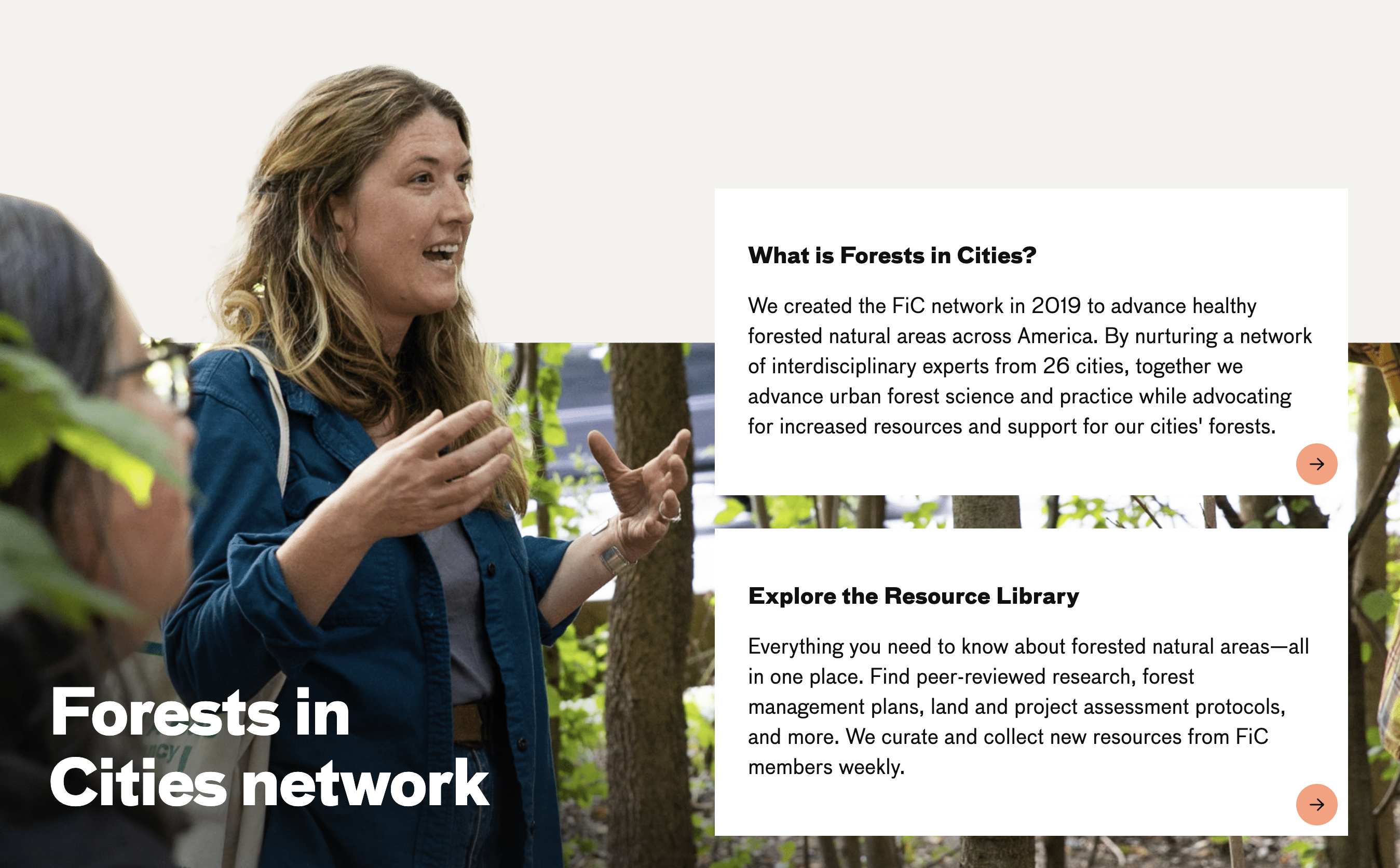
<h2 class="heading-1 mega">Forests in <br>Cities network</h2>
<div class="cards">
<!-- TODO: Add 2 text-only cards here using the pattern from style guide -->
</div>
</div>
</section>Your task: Refer to the Style Guide Demo and look for the Text-Only Card Pattern (Section 5 Style) in the "Hero Section and Cards" area. Copy that HTML structure and create 2 cards with the following content:
-
What is Forests in Cities? - Link:
https://naturalareasnyc.org/forests-in-cities-network/, Heading: "What is Forests in Cities?", Text: "We created the FiC network in 2019 to advance healthy forested natural areas across America. By nurturing a network of interdisciplinary experts from 26 cities, together we advance urban forest science and practice while advocating for increased resources and support for our cities' forests.", Accessibility text: "FiC" -
Explore the Resource Library - Link:
https://fic.naturalareasnyc.org/, Heading: "Explore the Resource Library", Text: "Everything you need to know about forested natural areas—all in one place. Find peer-reviewed research, forest management plans, land and project assessment protocols, and more. We curate and collect new resources from FiC members weekly.", Accessibility text: "Explore the Resource Library"
CSS (section5.css)
Attach the stylesheet in your HTML <head>:
<link rel="stylesheet" href="section5.css">Start with this CSS:
#section-5 {
  background-image: url(../images/section-5-bkg.png);
  background-size: 100% auto;
  background-repeat: no-repeat;
  background-position: left bottom;
  padding-top: 20vw;
  min-height: 600px;
  display: flex;
  flex-direction: column;
  justify-content: flex-end;
}

.heading-1.mega {
  color: white;
  font-size: 4rem;
}

#section-5 .container {
  display: grid;
  grid-template-columns: 1fr 1fr;
  gap: 2rem;
  align-items: flex-end;
  border-bottom: 1px solid white;
}

.cards {
  display: grid;
  gap: 50px;
  padding-bottom: 50px;
}
Your tasks:
-
Add responsive CSS: Add media queries for
max-width: 1024pxandmax-width: 768pxthat:- Change heading color to
blackand adjust font size (3rem for 1024px, 2rem for 768px) - Remove background image (
background: none) and adjust padding-top to16vw - Change container to single column (
grid-template-columns: 1fr) - Adjust container gap and padding for smaller screens
- Adjust card spacing (
gapfor.cards) - Adjust card article padding and typography sizes for smaller screens
/* TODO: Add responsive CSS here */ @media screen and (max-width: 1024px) { /* TODO: Add the remaining responsive styles for 1024px and 768px here */ } - Change heading color to