6. The NYC Nature Map
Folder: 06_data_visualizations/
Files: index.html, section4.css
Overview
The column HTML structure is already provided in the style guide and in utility-classes.css. Your job is to:
- Reference the style guide for the column HTML structure
- Create the section with 2 columns
- Add CSS for the section layout and responsive design
HTML (index.html)
Start with this HTML structure, which you will paste inside the <main></main> tag:
<!-- Section 4 (The NYC Nature Map) -->
<section id="section-4">
    <div class="container grid">
        <!-- TODO: Add 2 columns here using the pattern from style guide -->
    </div>
</section>
Your task: Refer to the Style Guide Demo and look for the Column Layout pattern in the "Layout Classes" section. Copy that HTML structure and create 2 columns with the following content:
-
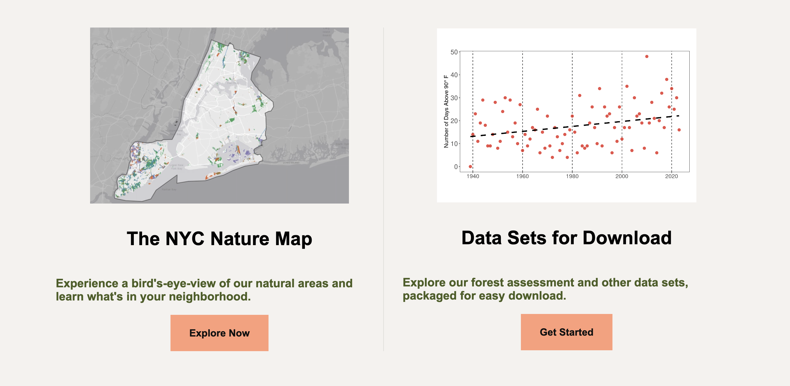
The NYC Nature Map - Image:
../images/callout1.jpg, Heading: "The NYC Nature Map", Text: "Experience a bird's-eye-view of our natural areas and learn what's in your neighborhood.", Link:https://naturalareasnyc.org/nyc-nature-map/, Button: "Explore Now" -
Data Sets for Download - Image:
../images/data-screenshot.webp, Heading: "Data Sets for Download", Text: "Explore our forest assessment and other data sets, packaged for easy download.", Link:https://naturalareasnyc.org/data-sets-for-download/, Button: "Get Started"
Note: The .column class and its styles are already in utility-classes.css, so you only need to use the HTML structure from the style guide.
CSS (section4.css)
Attach the stylesheet in your HTML <head>:
<link rel="stylesheet" href="section4.css">Start with this CSS:
#section-4 {
  max-width: 1150px;
  margin: 0 auto;
}

#section-4 .grid {
  grid-template-columns: repeat(2, 1fr);
  gap: 2rem;
}
Your tasks:
-
Add responsive CSS: Add a media query for
max-width: 1024pxthat:- Changes grid to single column (
grid-template-columns: 1fr) - Adjusts gap to
3rem
@media screen and (max-width: 1024px) { /* TODO: Add the remaining responsive styles here */ } - Changes grid to single column (