5. Join Our Efforts
Folder: 05_join_our_efforts/
Files: index.html, section3.css
Overview
The icon card HTML structure is already provided in the style guide. Your job is to:
- Reference the style guide for the icon card HTML structure
- Create 4 icon cards using that pattern
- Add CSS for the section layout, background image, and responsive design
HTML (index.html)
The starter file already contains the HTML structure inside the <main></main> tag. Open index.html to see the section with heading and a TODO comment for adding 4 icon cards.
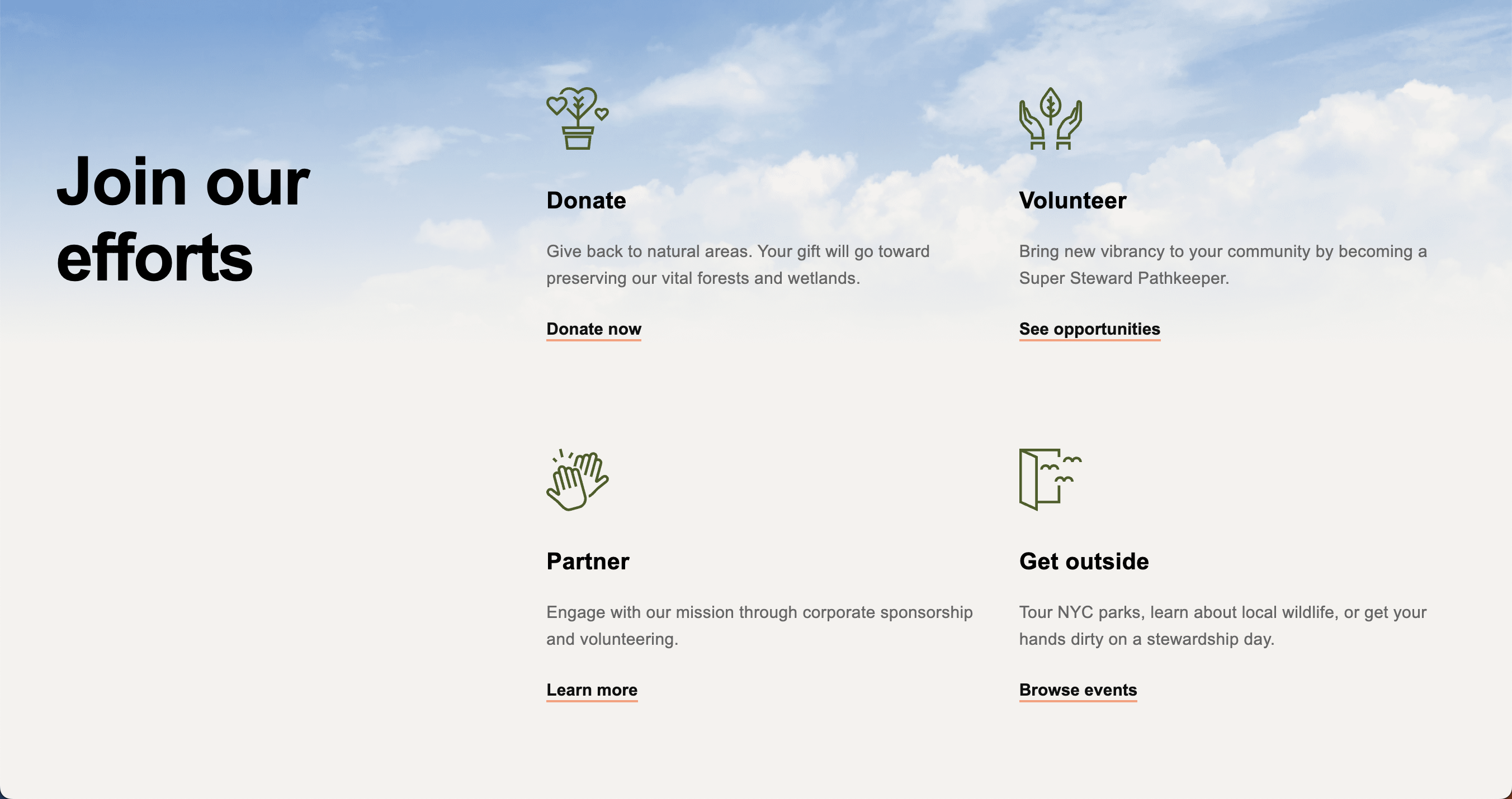
Your task: Refer to the Style Guide Demo and look for the Icon Card Pattern (Section 3 Style) in the "Hero Section and Cards" area. Copy that HTML structure and create 4 cards with the following content:
-
Donate - Link:
https://naturalareasnyc.org/donate/, Icon:../images/icon-donate.svg, Text: "Give back to natural areas. Your gift will go toward preserving our vital forests and wetlands.", Button: "Donate now" -
Volunteer - Link:
https://naturalareasnyc.org/super-steward-program/, Icon:../images/icon-volunteer.svg, Text: "Bring new vibrancy to your community by becoming a Super Steward Pathkeeper.", Button: "See opportunities" -
Partner - Link:
https://naturalareasnyc.org/corporate-partnerships/, Icon:../images/icon-partner.svg, Text: "Engage with our mission through corporate sponsorship and volunteering.", Button: "Learn more" -
Get outside - Link:
/events, Icon:../images/icon-get-outside.svg, Text: "Tour NYC parks, learn about local wildlife, or get your hands dirty on a stewardship day.", Button: "Browse events"
CSS (section3.css)
The starter file already contains the CSS structure. Open section3.css to see the existing styles with a TODO comment for responsive CSS.
Your tasks:
-
Add responsive CSS: Add a media query for
max-width: 1024pxthat:- Adjusts padding for the section to
60px 0 - Changes container to single column (
grid-template-columns: 1fr) - Changes grid to single column (
grid-template-columns: 1fr) - Adjusts row-gap to
3rem - Sets icon height to
48px
Start with this media query stub (one example is already implemented):
@media screen and (max-width: 1024px) { #section-3 { padding: 60px 0; } /* TODO: Add the remaining responsive styles here */ } - Adjusts padding for the section to