4. What We Do
Folder: 04_what_we_do/
Files: index.html, section2.css
Overview
The card HTML structure is already provided in the style guide. Your job is to:
- Reference the style guide for the card HTML structure
- Create a section with heading and 4 cards
- Add CSS for the section layout and styling
HTML (index.html)
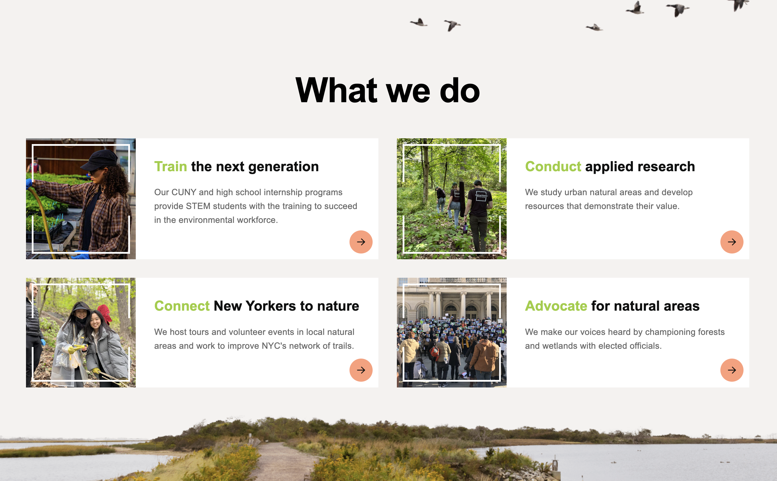
The starter file already contains the HTML structure inside the <main></main> tag. Open index.html to see the section with heading, geese image, and a TODO comment for adding 4 cards.
Your task: Refer to the Style Guide Demo and look for the Card pattern in the "Hero Section and Cards" area. Copy that HTML structure and create 4 cards with the following content:
-
Train - Link:
https://naturalareasnyc.org/internships/, Image:../images/card-intern.jpg, Alt: "Intern waters planters with a hose inside greenhouse", Heading:<span>Train</span> the next generation, Text: "Our CUNY and high school internship programs provide STEM students with the training to succeed in the environmental workforce.", Accessibility: "Internships" -
Conduct - Link:
https://naturalareasnyc.org/research/, Image:../images/card-staff.jpg, Alt: "Three staff members walk one by one into a forest, NAC logos are visible on back of shirts", Heading:<span>Conduct</span> applied research, Text: "We study urban natural areas and develop resources that demonstrate their value.", Accessibility: "Innovative Research" -
Connect - Link:
https://naturalareasnyc.org/connect-nyc-to-nature/, Image:../images/card-program.jpg, Alt: "Two volunteers smiling wearing safety gloves, one holds a branch", Heading:<span>Connect</span> New Yorkers to nature, Text: "We host tours and volunteer events in local natural areas and work to improve NYC's network of trails.", Accessibility: "Connect New Yorkers to Nature" -
Advocate - Link:
https://naturalareasnyc.org/coalition-advocacy/, Image:../images/card-advocacy.jpg, Alt: "Large group of protestors holding Play Fair signs stand on steps of NYC city hall", Heading:<span>Advocate</span> for natural areas, Text: "We make our voices heard by championing forests and wetlands with elected officials.", Accessibility: "Coalition Advocacy"
CSS (section2.css)
The starter file already contains the CSS structure. Open section2.css to see the existing styles with a TODO comment for responsive CSS.
Your tasks:
-
Add responsive CSS: Add a media query for
max-width: 1024pxthat:- Changes grid to single column (
grid-template-columns: 1fr) - Adjusts gap to
1.5rem - Adjusts section padding-bottom to
200px - Adds margin-top of
50pxto the section - Adjusts heading font-size to
2.5remand padding-top to30px - Adjusts geese image positioning (
right: 10px,top: 10px) and size (width: 300px,height: auto)
Start with this media query stub (one example is already implemented):
@media screen and (max-width: 1024px) { #section-2 .grid { grid-template-columns: 1fr; } /* TODO: Add the remaining responsive styles here */ } - Changes grid to single column (