3. Video Introduction
Folder: 03_video_intro/
Files: index.html, section1.css
Overview
Much of the section 1 code structure is already provided. Your job is to:
- Implement the video label with play button and text
- Add responsive CSS for mobile devices
HTML (index.html)
The starter file already contains the HTML structure inside the <main></main> tag. Open index.html to see the section structure with a TODO comment for the video label.
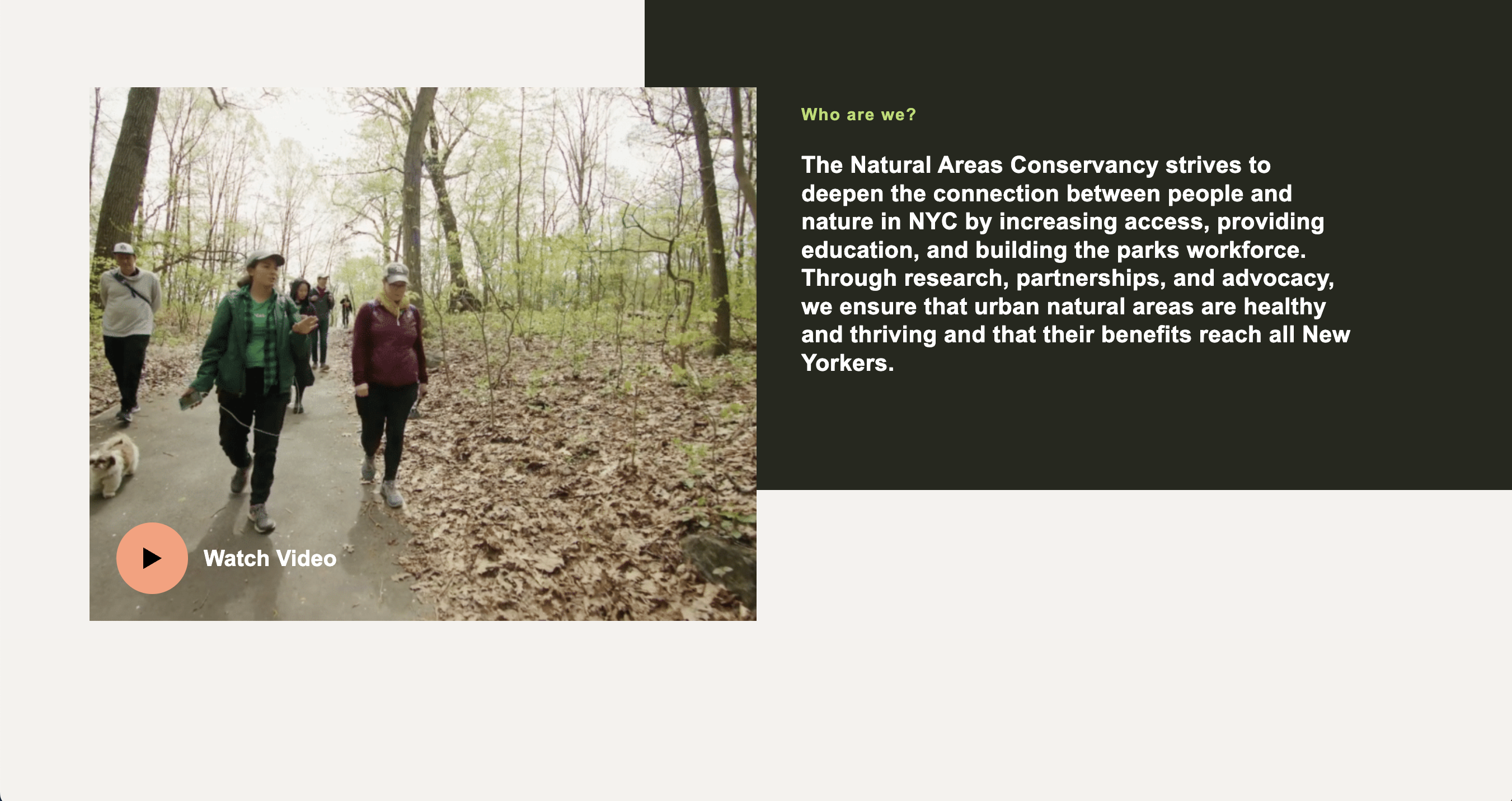
Your task: Add the video label inside the <a> tag (where the TODO comment is). The video label should include:
- A
<span>with classvideo-label - Inside it, a
<span>with classesbtn icon play largefor the play button - A
<span>with classheading-4containing the text "Watch Video"
In other words, it should look something like this:
<span class="video-label">
    <span class="btn icon play large"></span>
    <span class="heading-4">Watch Video</span>
</span>
If you've made the above changes and nothing is showing up, don't worry: the content is just be hidden behind the video image. We will adjust this in the CSS.
CSS (section1.css)
The starter file already contains the CSS structure. Open section1.css to see the existing styles with TODO comments for the video label and responsive CSS.
Your tasks:
- Style the video label: Create a CSS class called
.video-label. This class will position your label so that it is overlaid on top of the video to the bottom and left:-
Use flexbox:
display: flex; align-items: center; gap: 20px; -
To position the label above the video and on the bottom right:
position: absolute;
bottom: 24px;
left: 24px;
z-index: 5;   /* so the container appears above the video */
-
Missing Play Button Image: Phoebe S. pointed out that I forgot to include the play button in the
imagesfolder, so if you're not seeing a black triangle, please download btn-play.svg and save it in yourmidterm/imagesfolder.
-
Add responsive CSS: Add a media query for screens with
max-width: 1024pxthat:- Changes the grid to single column (
grid-template-columns: 1fr) - Makes the media container full width (remove max-width, set to 100%)
- Removes the top and left margins from the media container
- Adjusts the content-styles padding to
40px 30px
Start with this media query stub (one example is already implemented):
@media screen and (max-width: 1024px) { #section-1 { grid-template-columns: 1fr; } /* TODO: Add the remaining responsive styles here */ } - Changes the grid to single column (