Assignments > CSS Lab
Due Thu, 10/23 at 11:59pm
Overview
This lab can be completed individually or in pairs. Working in pairs does not mean "splitting up the work" so that each person does half of the tasks. Rather, both parties should complete the tasks and help one another as questions arise. We will use class time on Tuesday to work on the lab, but you are encouraged to start it before class.
References
CSS is best understood through practice, and by consulting online resources as needed. Here are a curated list of resources that should help you complete your tasks:
Common CSS Properties and Techniques
- CSS Rules of Thumb
- Selectors
- Color
- CSS Units
- Text & Fonts
- The Box Model
- CSS Grid
- Flexbox
- Media Queries
CSS Grid
- CSS Grid Garden
Please try to complete at least the first 10 levelsFlex
- Flexbox Froggy.
Please try to complete at least the first 10 levels
Your Tasks
Download the lab04.zip file, unzip it and move the unzipped lab04 folder into the mser521 folder (see diagram below).
mser521
    ├── intro-html
    ├── lab02
    ├── lab03
    └── lab04
        ...
Task 1: CSS Selectors
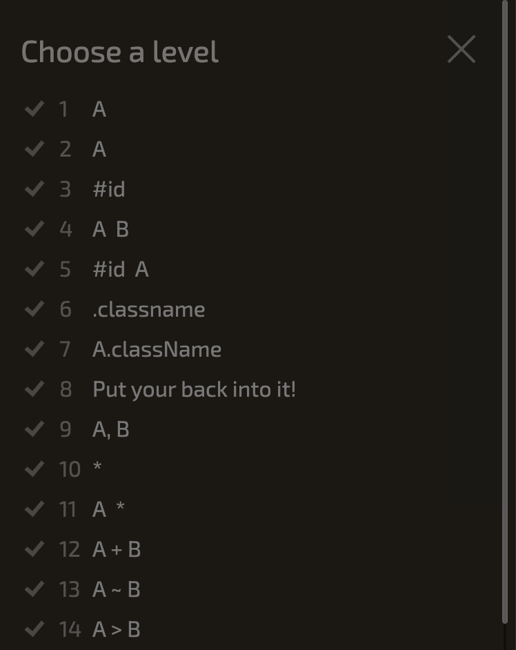
Complete the first 14 steps of CSS Diner. When you're done, take a screenshot showing you completed all of the levels. Your screenshot should have a green checkmark next to each level (like the one below but with checkmarks).
Task 2: Box Model Properties
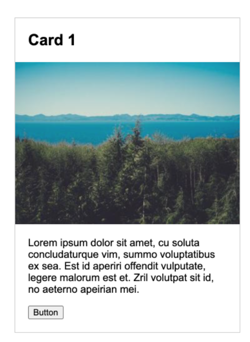
Open 02-box-model and modify the CSS so that the card looks like the screenshot shown below. You should only need to use Box Model CSS properties.
Task 3: Use an external stylesheet
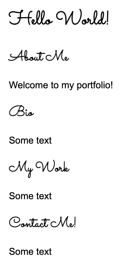
Open 03-fonts and use CSS to style the h1 and h2 tags using a Google font (example shown below). If you need help...
- Check out this video
- You can also Google "How to use a Google Font in CSS"
Task 4: Center-align elements within a container
Open 04-flex and create the layout shown below by editing the CSS file. You should not need to edit the HTML. Some hints:
- Put each of the containers into "flex" mode and give them a height of 100vh (vh stands for viewport height)
- To get the children of the container to stack vertically, experiment with the "flex-direction" property
- To align the items horizontally and vertically, experiment with the "justify-content" and "align-center" properties
Check out the Flexbox documentation for help.
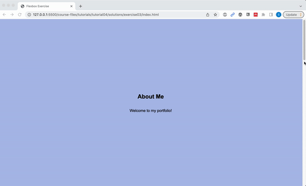
Please ensure that the following criteria are met:
- The height of each
sectionshould be the same as the height of the browser window. - The content inside of each
sectiontag should be centered horizontally and vertically. - Each
sectionshould have a different background color. - The content in each
sectionshould be stacked vertically
Task 5: Create a Navigation Bar
Open 05-navbar, and try to make the following layout using flex. The boxes don't have to look exactly like the ones below, but do your best:

Hints:
- Both the
navandulelements will need to be put into flex mode. - Use the Chrome inspector to adjust the alignment properties.
- To turn the bullets off, set the
ultag'slist-style-typeproperty tonone.
Task 6: Create this layout
Open 06-grid, and try to make the following layout using CSS Grid. You should not need to modify the HTML file. Note that the gridlines are just for demonstration, but they won’t actually be visible.
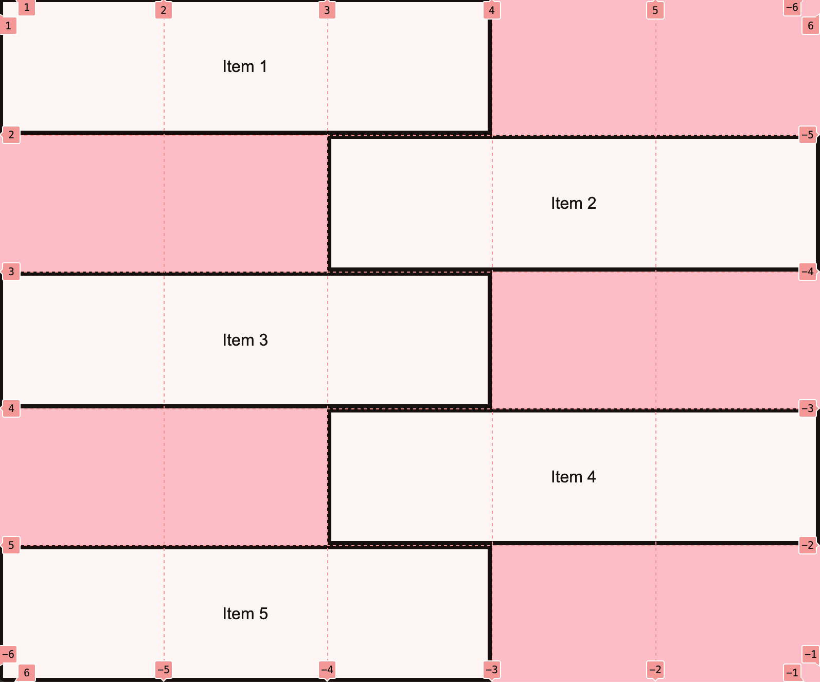
Note: You do NOT have to center the text inside of each section unless you want to. Check out the CSS Grid documentation for help.
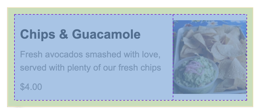
Task 7: Create the Taco Temple layout
Open 07-tacotemple, and try to make the following layout using CSS Grid. You should only have to edit the CSS file.
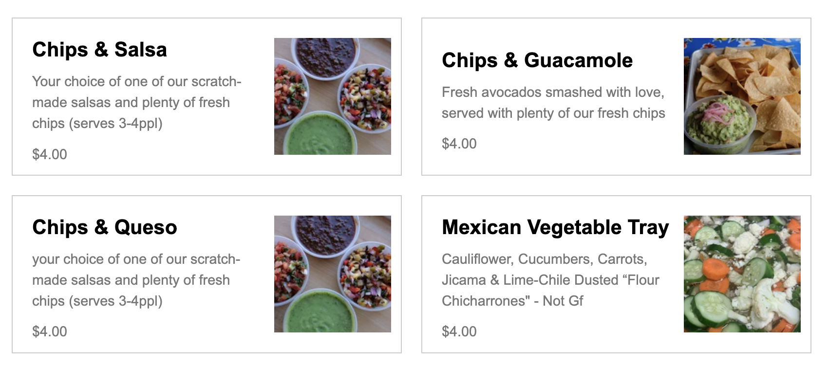
A few hints:
The main container is a grid with two columns -- no rows specified). See grid lines:
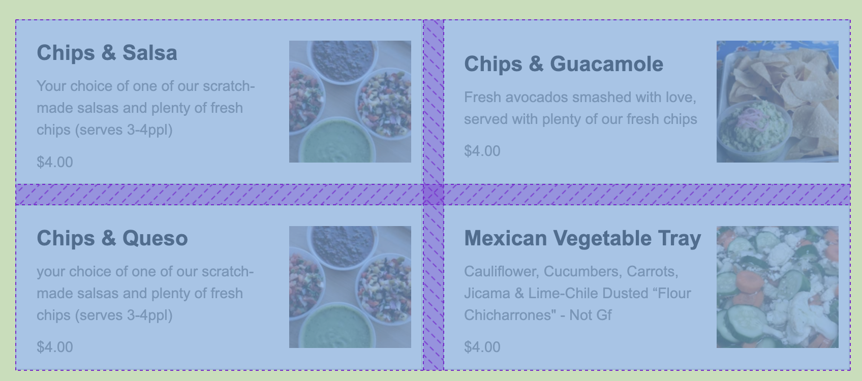
The section container is also a grid with two columns. See grid lines:
What to turn in
Please create a link from your homepage to your completed in class (see Sarah's homepage: https://vanwars.github.io/mser521/ for an example). Then, commit and push all of your edits to GitHub and, paste a link to your GitHub Repository and to your GitHub pages in the Moodle submission.