Schedule > CSS Flourishes
Please download the exercise files (below), and then pick one of the three options to try:
Pick ONE of the Following Exercises
1. Practice Using Background Images
See if you can create an interesting scene that uses background images:
1.1. Uncomment the relevant CSS properties
Open in-class-exercise and take a look at the HTML and CSS files to get oriented with them. Then, before making any changes to the code, preview the index.html page in your web browser.
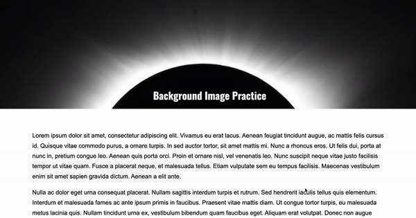
After previewing your webpage, uncomment the following lines inside your styles.css file within your header style block.
  /* background-image: url('solar-eclipse.jpg');
    background-repeat: no-repeat;
    background-size: cover;
    background-position-x: center;
    background-position-y: center; */
When you're done, preview the page, noting what changed. You should now see a background image in your header of a solar eclipse.
Next, uncomment the following lines within your #section2 style block:
/* background-image: url('solar-eclipse-multiples.jpg');
background-repeat: no-repeat;
background-position: center right;
background-size: contain;
background-attachment: fixed; */
When you're done, preview the page. You should now see a background image of a series of photos of an eclipse behind a box of white text. The image should be anchored as you scroll.
- Note that if you remove the
background-attachment: fixed;declaration, the background image will move with the scroll bar (no anchoring). Try it!
1.2. Add Custom Images
Customize this page with your own background images.
-
If you're looking for free images, check out:
-
When you've found some images that you like, save them inside of the
in-class-exercisefolder, and update the background-image file paths to point to your files. -
If you want to explore some of the other background properties, take a look at W3 Schools
1.3. Try Out the Filters
If you have time, also try playing with some of the background filters. Here is a list of available filters (also on W3 Schools). The options for the filter property are:
- none
- blur()
- brightness()
- contrast()
- drop-shadow()
- grayscale()
- hue-rotate()
- invert()
- opacity()
- saturate()
- sepia()
- url()
Hint: try adding filter: invert(180); to the header style block in your CSS file to see what happens.
1.4. Try adding a video background
- Take a look at the video background sample files and see if you can add a section somewhere on the page that has a video background. Refer to the
css-flourishes-demos/05-video-backgroundfolder to see if you can figure out how to do it. - pexels.com has some free video backgrounds that you can download.
2. Experimenting with Transitions
See if you can explore some interesting transitions:
2.1. Uncomment the relevant CSS style blocks
Inside of the in-class-exercise folder, take a look at the HTML and CSS files to get oriented with them. Then, before making any changes to the code, preview the index.html page in your web browser.
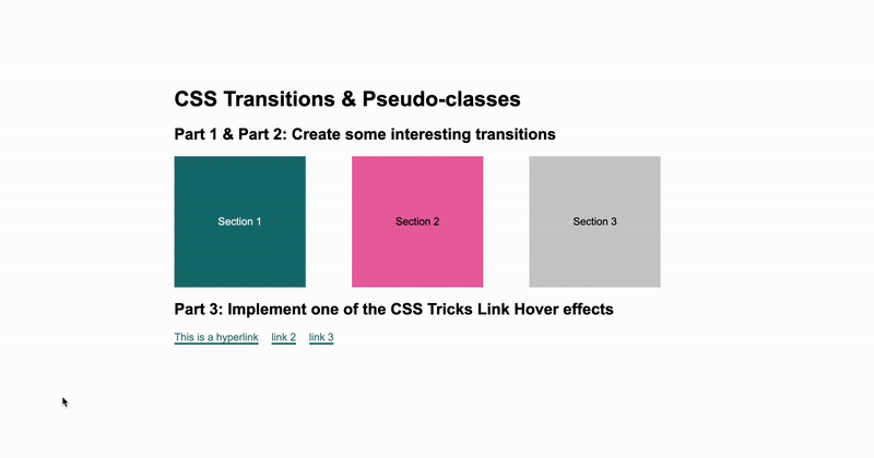
After previewing your webpage, uncomment the following lines inside your styles.css style block:
/*
#section1 {
    background: #0c7474;
    color: white;
    transition: all 0.3s ease-out;
}

#section1:hover {
    background: purple;
    width: 220px;
    height: 220px;
}
*/
When you're done, preview the page, noting what changed. When you hover over the first section, you the section should grow and change color (horray)!
2.2. Create two more transition effects
Your job is to experiment with the other two section tags (#section2 and #section3) by making some interesting interactions, using transitions. Some tips:
-
To make a transition, you define a transition inside of a style block (e.g.,
#section1) as follows:transition: <property> <duration> <timing-function> <delay>;Examples:- transition: all 0.3s ease-out;
- transition: background 1s ease-in;
- transition: all 3s linear;
- transition: all 0.3s ease;
-
Some properties that you may want to change:
- border-radius
- margin
- padding
- width
- height
- border-width
- background-color
- rotation
- opacity
- transform. Examples
transform: skewX(20deg);
transform: rotate(-10deg); {:.compact}
Feel free to look at sample-files/01-pseudo-classes and sample-files/02-pseudo-classes-with-transitions to get ideas.
2.3. Implement one of the CSS Tricks Effects
Relevant References
When you're done with parts 1-2, please try experimenting with hyperlink hover effects. Recall that hyperlinks have several relevant states that you want to style:
- a
- a:link
- a:hover (the main interactive state)
- a:focus (if the person tabs to the link)
- a:visited (if you want the style of visited links to look different)
- a:active (if you want a different style when the person clicks the link)
Click on some of the "CSS Tricks" links above, and see if you can implement one of the techniques that you find interesting.
3. Keyframes Exercise: Build a Landscape
See if you can create a landscape animation:
3.1. Uncomment the relevant CSS style blocks
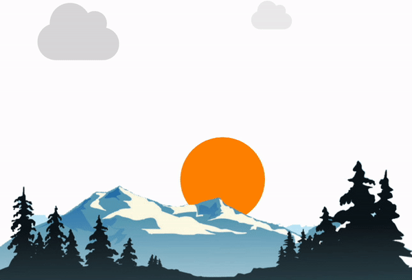
Inside of the your-task downloads folder, open 03-keyframes, and take a look at the HTML and CSS files to get oriented with them. Then, before making any changes to the code, preview the index.html page in your web browser. You should see one cloud moving from left to right.
After previewing your webpage, uncomment the following two code blocks inside your styles.css:
Inside of #sun:
/* animation-timing-function: linear;
    animation-fill-mode: forwards;
    animation-name: sunrise;
    animation-delay: 1s;
    animation-duration: 12s; */
Also comment out the corresponding keyframe that controls the sunrise:
/* @keyframes sunrise {
    0% {
        transform: translate(0, 0);
    }
    100% {
        transform: translate(0, -70vh);
    }
} */
When you’re done, preview the page, noting what changed. You should now see a second cloud moving from right to left.
3.2. Play around with the existing animation
- Try experimenting with the
animation-delay,animation-duration, andanimation-timing-function(ease-in, ease-out, ease, etc.) to change the speed and timing of the animation. - See if you can make the sun change from orange to yellow as it rises.
- See if you can make the size of the sun change as it rises.
- Hint: Add some additional style rules to the
to {}block of thesunrisekeyframe.
- Hint: Add some additional style rules to the
3.3. Make one of the clouds move
See if you can make #cloud1 animate from left to right. To do this, uncomment the following two code blocks inside your styles.css:
Within the #cloud1 selector:
/* transform: translate(-30vw, 0); */

/* animation-timing-function: linear;
animation-iteration-count: infinite;
animation-direction: alternate;
animation-name: moveCloudHorizontally;
animation-delay: 1s;
animation-duration: 18s; */
Also comment out the corresponding keyframe that controls the cloud movement:
/* @keyframes moveCloudHorizontally {
    0% {
        transform: translate(-30vw, 0);
    }
    100% {
        transform: translate(110vw, 0);
    }
} */
See what happens.
3.4. Add more clouds
See if you can add more clouds that move in different directions and at different speeds.
Keyframes Cheatsheet
| Property | Description |
|---|---|
| animation-name | Name of the keyframe you defined. |
| animation-timing-function | e.g., linear, ease-in, ease-out |
| animation-delay | how long to wait before animation starts |
| animation-iteration-count | How many times animation should repeat |
| animation-direction | normal, reverse, alternate, alternate-reverse |
| animation-fill-mode | e.g., forwards, backwards, normal, both (what to do when the animation stops) |
| animation-play-state | e.g., paused, running |