Schedule > CSS Layouts: Flex, Grid, and Media Queries
Please download the exercise files (below).
Then, try to complete the following exercises.
1. Media Query Exercise
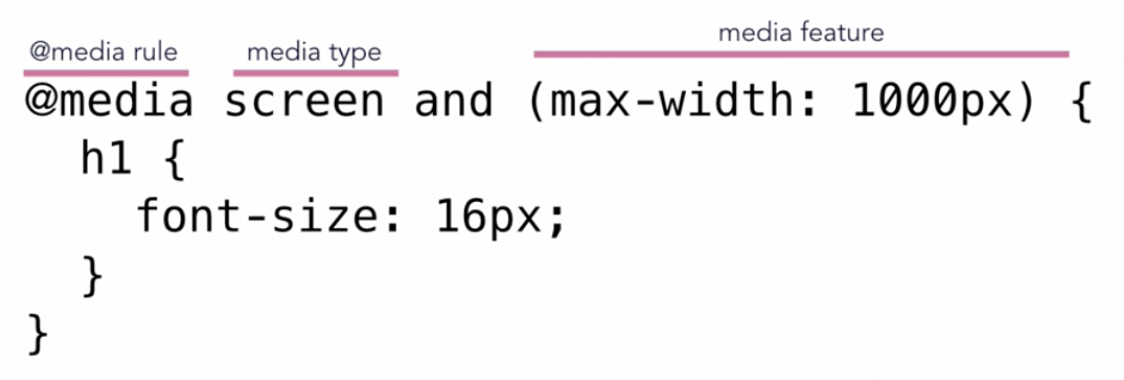
Media queries allow you to set CSS style rules based on the type of media and the device dimensions of the viewport. Typically, your stylesheet will need at least a few media query rules so that your website looks good on mobile devices. Example:
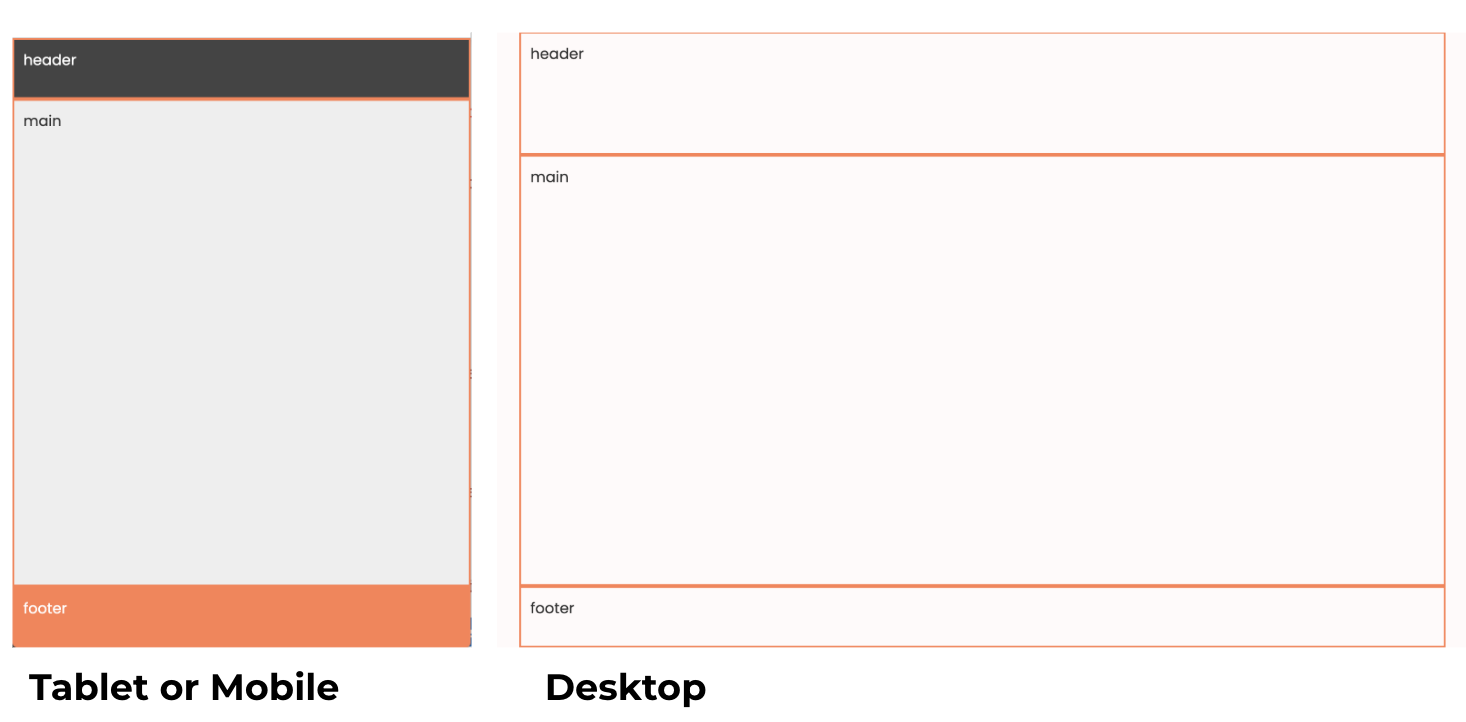
Please open 00-media-query and take a look at the files. When you're done, please add some CSS rules to create the following screens on Desktop and Mobile:
2. CSS Grid Exercise
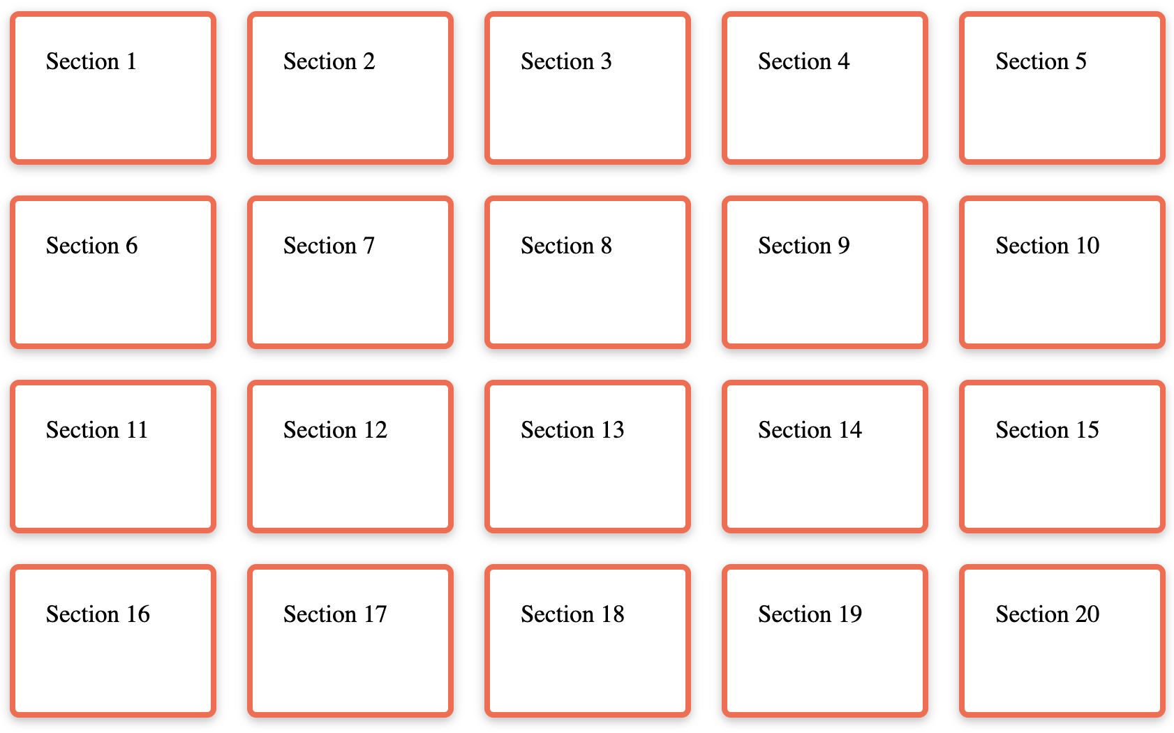
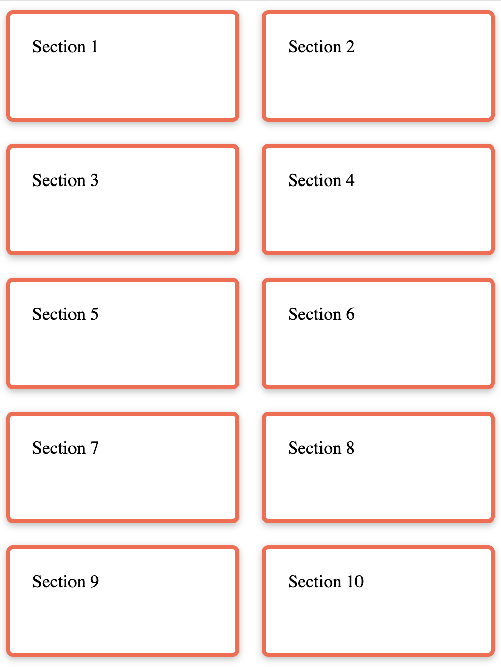
CSS Grid allows you to layout your page in terms of columns and rows. Please try creating the following layout
Desktop
Mobile
3. Flexbox Exercise
CSS Grid allows you to layout your page in terms of columns and rows. See if you can complete the following tasks:
- Style all of the
sectiontags:- Add a border to each of them (
border: solid 1px black;) - Give them a minimum width of
100px - Give them a minimum height of
100px - Give them some
padding
- Add a border to each of them (
- Make the height of the div 100% of the screen's height (viewport height)
- Put all of the section tags on the same line (in a row)
- Hint: put the parent of the section tags (the div with the "container" class) into
flexmode (display: flex;). - Add a gap between each of the children:
gap: 20px;
- Hint: put the parent of the section tags (the div with the "container" class) into
- Center the sections horizontally within the parent container
- Hint: set the parent’s
justify-contentproperty to “center”
- Hint: set the parent’s
- Center the sections vertically within the parent container
- Hint: set the parent’s
align-itemsproperty to “center”
- Hint: set the parent’s
- Experiment with the
flex-directionproperty - Experiment with the
flex-wrapproperty
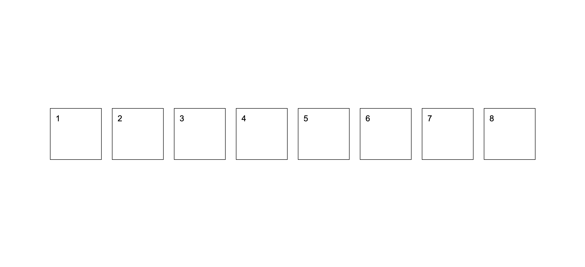
When you're done, your page should look like this:
Bonus: See if you can center the numbers within each section. Hint: to do this, you'll have to put the section into "flex" mode also and use the same tricks as before.
Tips
If you want to keep practicing, I highly recommend completing the Flexbox Froggy and CSS Grid Garden games.